
Designing a home that feels balanced, inviting, and timeless often begins with color. From wall paint and cabinetry to flooring and lighting, every shade plays a role in shaping the atmosphere of a space. Natural stone countertops add another powerful layer to this palette, offering organic color variations that connect interiors to nature itself. When chosen thoughtfully, stone becomes more than a surface — it becomes the anchor that brings the entire design together.
Homeowners working with experienced countertop installers Reynoldsburg, Ohio quickly discover that stone color selection is as much about harmony as it is about personal taste. Understanding how stone interacts with existing elements helps create interiors that feel intentional, cohesive, and effortlessly elegant.
Why Stone Color Sets the Tone
Stone countertops naturally draw the eye. Their size, texture, and pattern make them one of the most visually dominant features in kitchens and bathrooms. Because of this, stone color often sets the tone for the entire room rather than simply complementing it.
Lighter stones can open up a space and reflect natural light, while darker tones create depth and drama. Neutral stones provide flexibility, allowing homeowners to refresh décor over time without replacing major surfaces. Trusted countertop installers Reynoldsburg, Ohio help homeowners understand how stone color choices influence both mood and spatial perception.
Understanding Your Home’s Color Palette
Before selecting a stone, it is essential to evaluate the existing color palette of the home. Cabinetry, flooring, wall colors, and even furniture finishes all contribute to the overall visual balance. Stone should not compete with these elements but rather unify them.
Warm-toned homes often pair beautifully with stones that feature beige, gold, or soft brown undertones. Cooler palettes benefit from stones with gray, white, or subtle blue hues. Granite Depot of Columbus works with homeowners to assess these relationships, ensuring the chosen stone enhances the space rather than overwhelming it.
Light Stone for Bright, Open Spaces
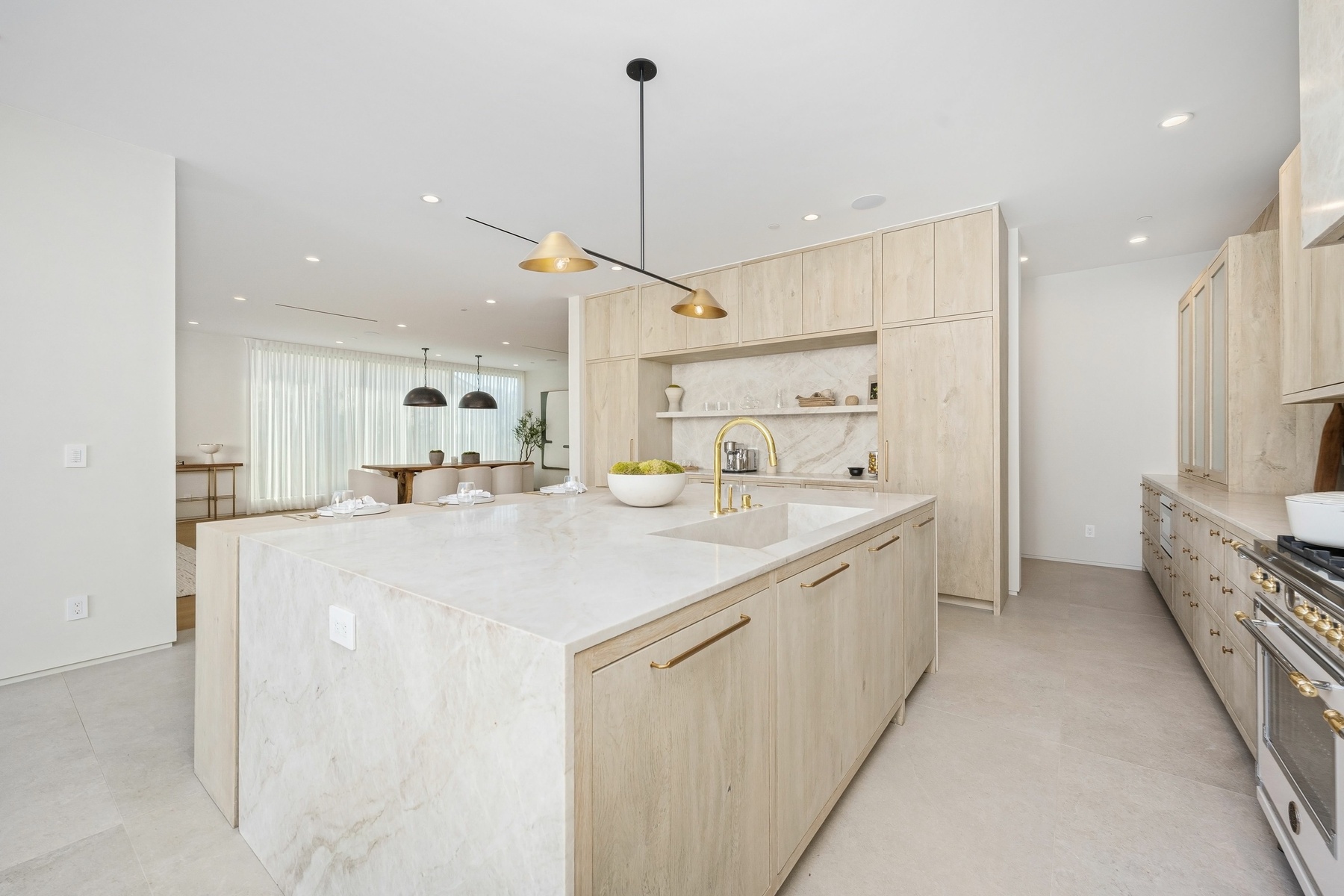
Light-colored stone countertops are a popular choice for homeowners seeking an airy, open feel. Whites, creams, and soft grays reflect light and create a sense of cleanliness and calm. These stones pair especially well with modern and transitional interiors, where simplicity and brightness are key.
In smaller kitchens or bathrooms, lighter stone can make the space feel larger and more inviting. Professional countertop installers Reynoldsburg, Ohio often recommend light stone when maximizing natural light and visual openness is a priority.
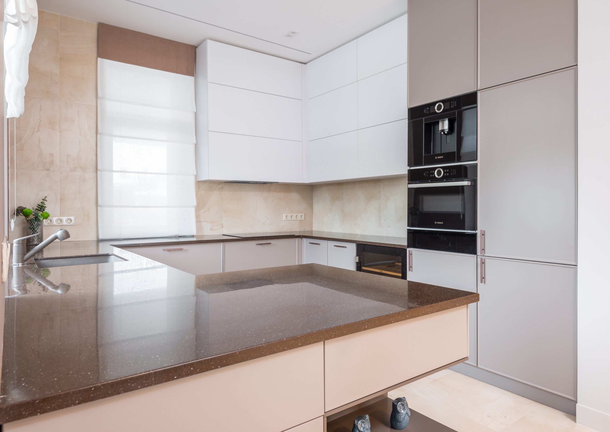
Dark Stone for Depth and Contrast
Dark stone countertops bring richness and sophistication to a home. Deep grays, charcoals, and black stones create striking contrast against lighter cabinetry and walls. When balanced correctly, dark stone adds drama without feeling heavy.
These tones work especially well in open-concept spaces, where the countertop can serve as a visual anchor. Granite Depot of Columbus helps homeowners balance dark stone with lighting and surrounding finishes to ensure the space feels refined rather than closed in.
Neutral Stones for Long-Term Flexibility
Neutral stone colors remain a favorite for homeowners who value timeless design. Soft beiges, warm grays, and subtle mixed tones adapt easily to changing décor trends. These stones allow homeowners to update paint colors, hardware, or accessories without clashing with major surfaces.
Because of their versatility, neutral stones are often recommended by countertop installers Reynoldsburg, Ohio for homeowners planning to live in their homes long term or considering future resale value.
Letting Veining Guide Color Coordination
Veining plays a crucial role in how stone interacts with a home’s palette. Bold veining can introduce contrast and movement, while subtle patterns create a more understated look. The colors within the veining often provide natural cues for coordinating cabinetry, backsplashes, and accents.
Rather than matching everything exactly, designers often pull secondary tones from the stone to create a layered, cohesive design. Granite Depot of Columbus helps homeowners identify these nuances, turning stone veining into a guide rather than a challenge.
Matching Stone with Cabinetry Styles
Cabinetry and countertops share a close visual relationship. The right stone color enhances cabinet finishes, while the wrong one can create visual tension. Light cabinets often pair well with both light and dark stone, depending on the desired contrast. Dark cabinets benefit from stones that introduce brightness or subtle variation.
Experienced countertop installers Reynoldsburg, Ohio understand how to balance these elements, ensuring the countertop complements cabinetry without overpowering it. This balance is essential for achieving a polished, professional look.
Coordinating Stone with Flooring and Walls
Stone does not exist in isolation from floors and walls. Flooring tones, whether wood, tile, or stone, should harmonize with the countertop rather than clash. Similarly, wall colors should support the stone’s undertones.
Cool-toned floors often pair best with stones that share similar undertones, while warm floors benefit from warmer stone colors. Granite Depot of Columbus works with homeowners to view samples together, helping them visualize how all surfaces interact within the space.
The Role of Lighting in Color Selection
Lighting dramatically affects how stone color appears. Natural daylight brings out different tones than artificial lighting, and warm versus cool bulbs can change the perception of color entirely. A stone that appears neutral in one environment may look warmer or cooler in another.
Professional countertop installers Reynoldsburg, Ohio consider lighting conditions during the selection process, ensuring the chosen stone maintains its intended appearance throughout the day and evening.
Creating Flow Throughout the Home
Color coordination does not stop at one room. In open layouts or connected spaces, stone color should contribute to a sense of flow. Using complementary tones across kitchens, bathrooms, and secondary surfaces creates visual continuity.
This does not mean every surface must match, but they should relate to one another. Granite Depot of Columbus helps homeowners create this balance, ensuring stone selections feel cohesive throughout the home.
Balancing Trends with Timeless Design
While trends influence color choices, natural stone offers the advantage of longevity. Trend-forward colors can be incorporated subtly through veining or secondary tones, while the primary stone color remains timeless.
Homeowners who work with countertop installers Reynoldsburg, Ohio often find that choosing stone with natural variation allows them to enjoy current trends without committing to designs that may feel dated over time.
Stone as the Bridge Between Nature and Design
Natural stone brings the outdoors inside, grounding interior spaces with organic color and texture. When paired thoughtfully with a home’s palette, stone creates a seamless connection between nature and design.
Granite Depot of Columbus emphasizes this philosophy, guiding homeowners toward stone selections that feel natural, balanced, and enduring. By working with experienced countertop installers Reynoldsburg, Ohio, homeowners can ensure their stone surfaces enhance both beauty and livability.
A Thoughtful Approach to Color Coordination
Designing with stone is as much about intention as it is about aesthetics. Color coordination transforms countertops from standalone features into integral parts of the home’s design story. When stone, cabinetry, flooring, and lighting work together, the result is a space that feels complete and harmonious.
With expert guidance from Granite Depot of Columbus and the craftsmanship of trusted countertop installers Reynoldsburg, Ohio, homeowners can confidently select stone colors that elevate their interiors. By pairing nature’s palette with thoughtful design choices, stone countertops become the foundation of a home that feels both beautiful and balanced.